- Role
- Product designer
- Period
- Jun 2023 to Oct 2024
- Focus
- The whole app, from design system to transfers
- Platform
- iOS, Android and web
Context
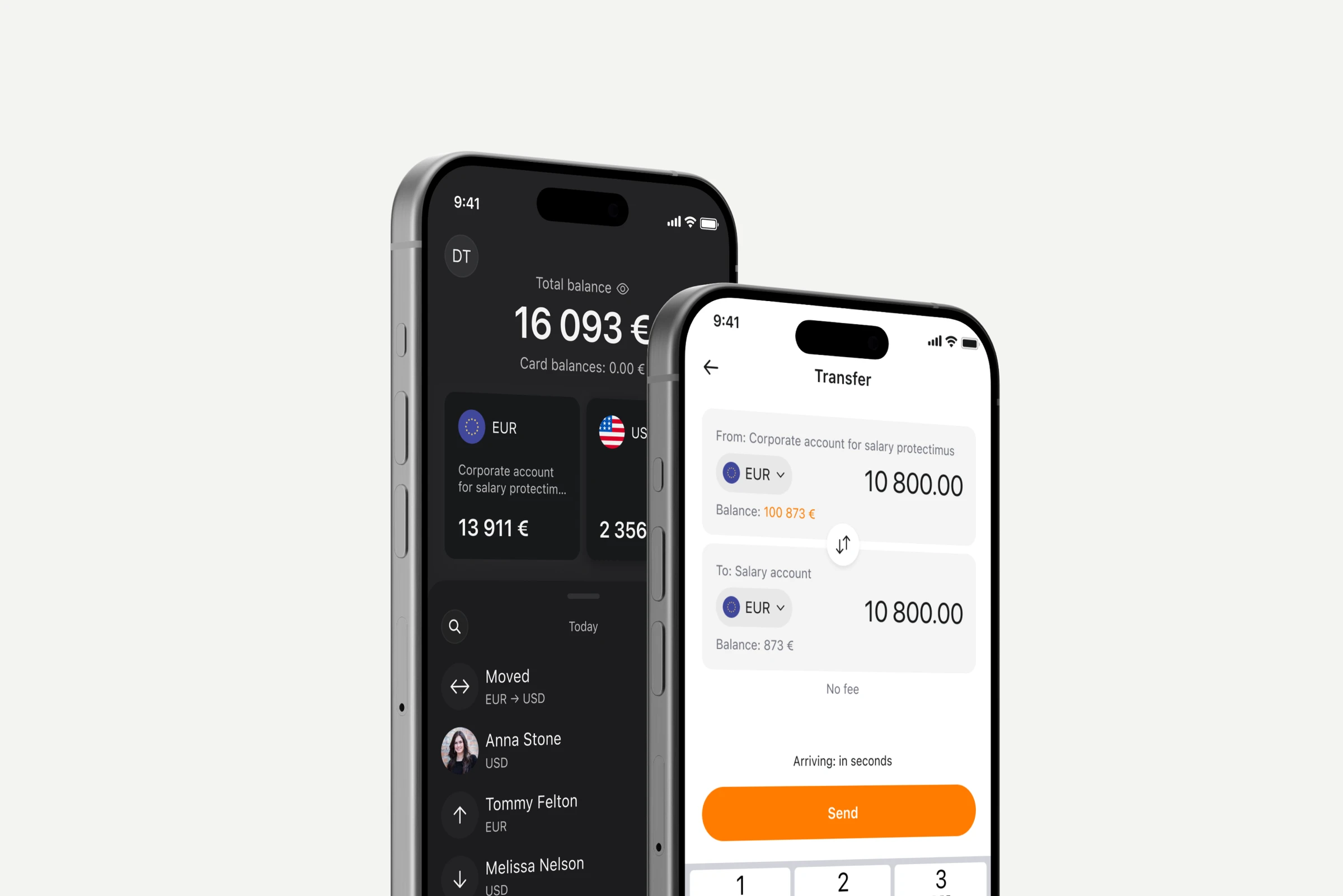
Yetlo lets users transfer money across European countries with low commission and favorable exchange rates. The product covers both personal and business accounts, managed through mobile apps and a web platform, with euro and dollar cards planned for a later phase.
As the sole designer, I worked end-to-end across every surface — iOS, Android, web app, admin panel, email templates, the marketing site, and dark theme adaptation for all platforms.
I joined after development had started: engineering already had the app's skeleton in place, so a ground-up redesign was off the table. The work was to make the flows clearer and more capable within that structure, improving hierarchy, states and edge cases without breaking what was already built.
Design system
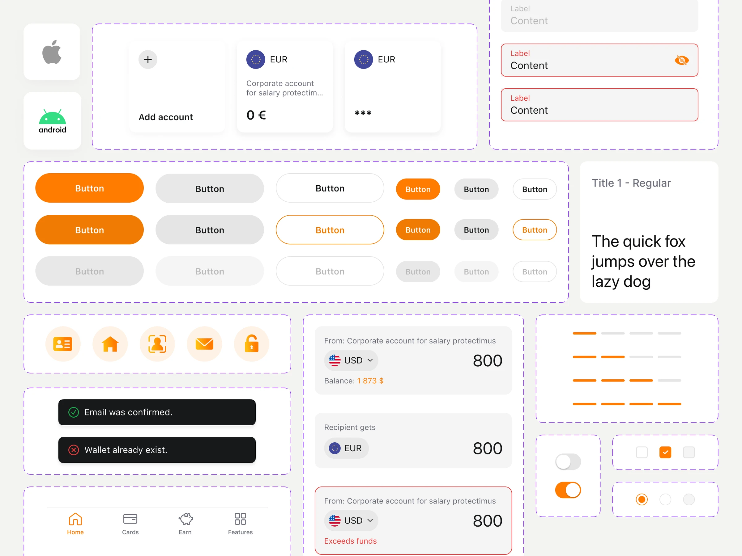
I built Yetlo's design system for iOS, Android and web. Shared foundations (colour, typography, spacing and iconography) and a core component library (buttons in every size and state, inputs with validation and errors, account cards, toasts, progress, selection controls and navigation) keep the product consistent on every surface.
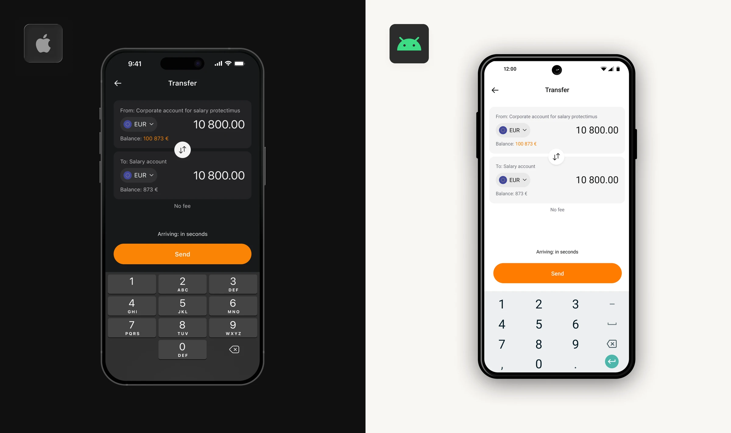
Consistency did not mean identical. Components follow Apple's Human Interface Guidelines on iOS and Material Design on Android, from navigation patterns and system controls to touch targets and type, so the app feels native on each platform, while the web reuses the same components in desktop layouts. Light and dark themes are part of the foundations, so every screen ships in both.
For the team, the system turned design decisions into reusable parts: new flows were assembled from existing components instead of being drawn from scratch, which kept handoff fast and the three platforms in step.
Send money
Challenge
The core challenge was making transfers between accounts feel effortless — letting users pick accounts, see balances and account descriptions, and choose the right transfer method. Critically, this had to be built as a reusable module: the same solution needed to work for business users sending SEPA transfers and Yetlo-link payments.
Approach
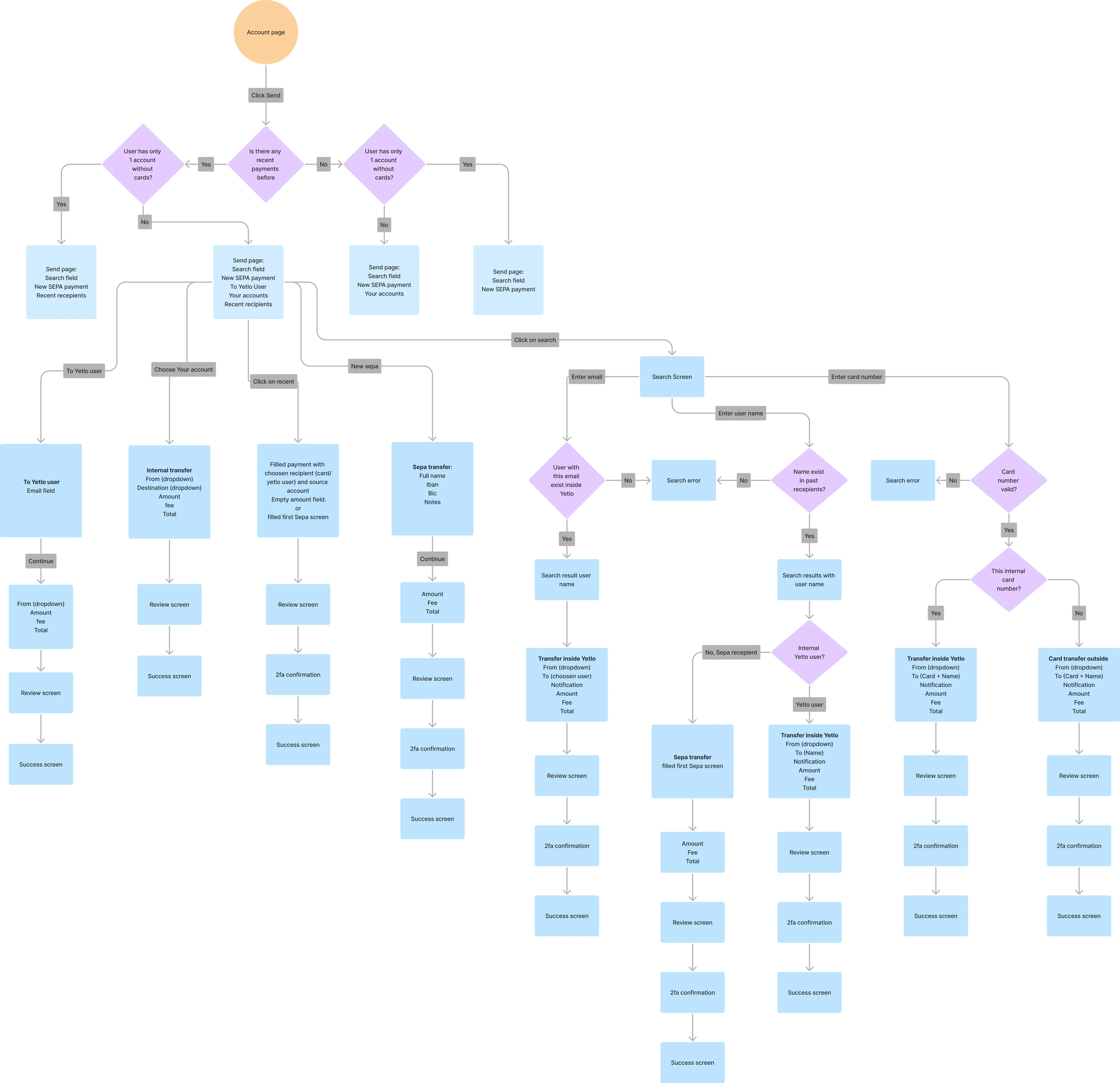
We identified four sending methods:
- SEPA transfer
- Transfer between your own wallets
- Transfer to a Yetlo user by email
- Transfer to a Yetlo user via Yetlo link
Solution
The solution centered on a flexible transfer module handling multiple user types (personal and business) and multiple methods — designed for reusability, scalability, and compliance with the different requirements of each transfer type.
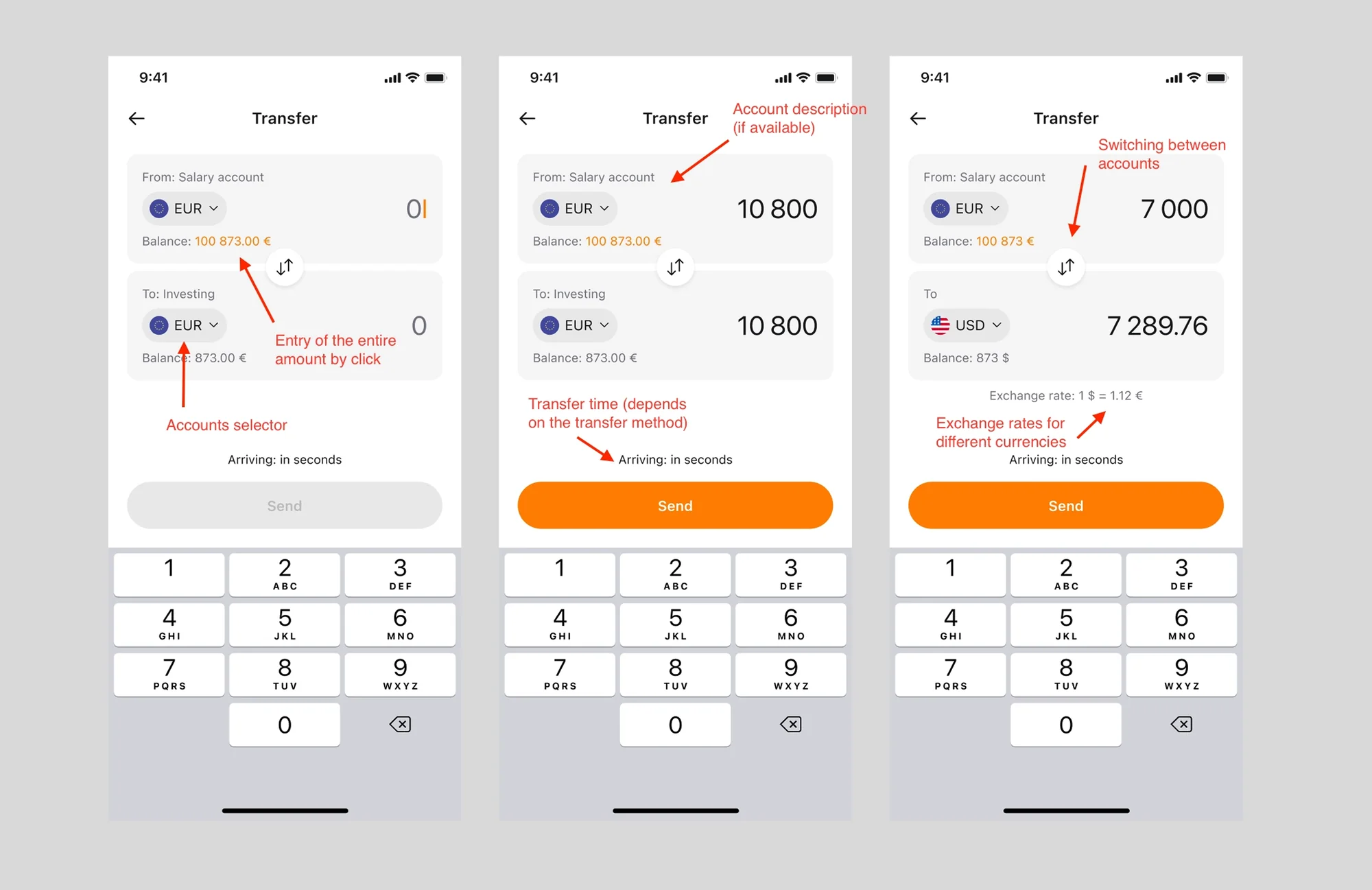
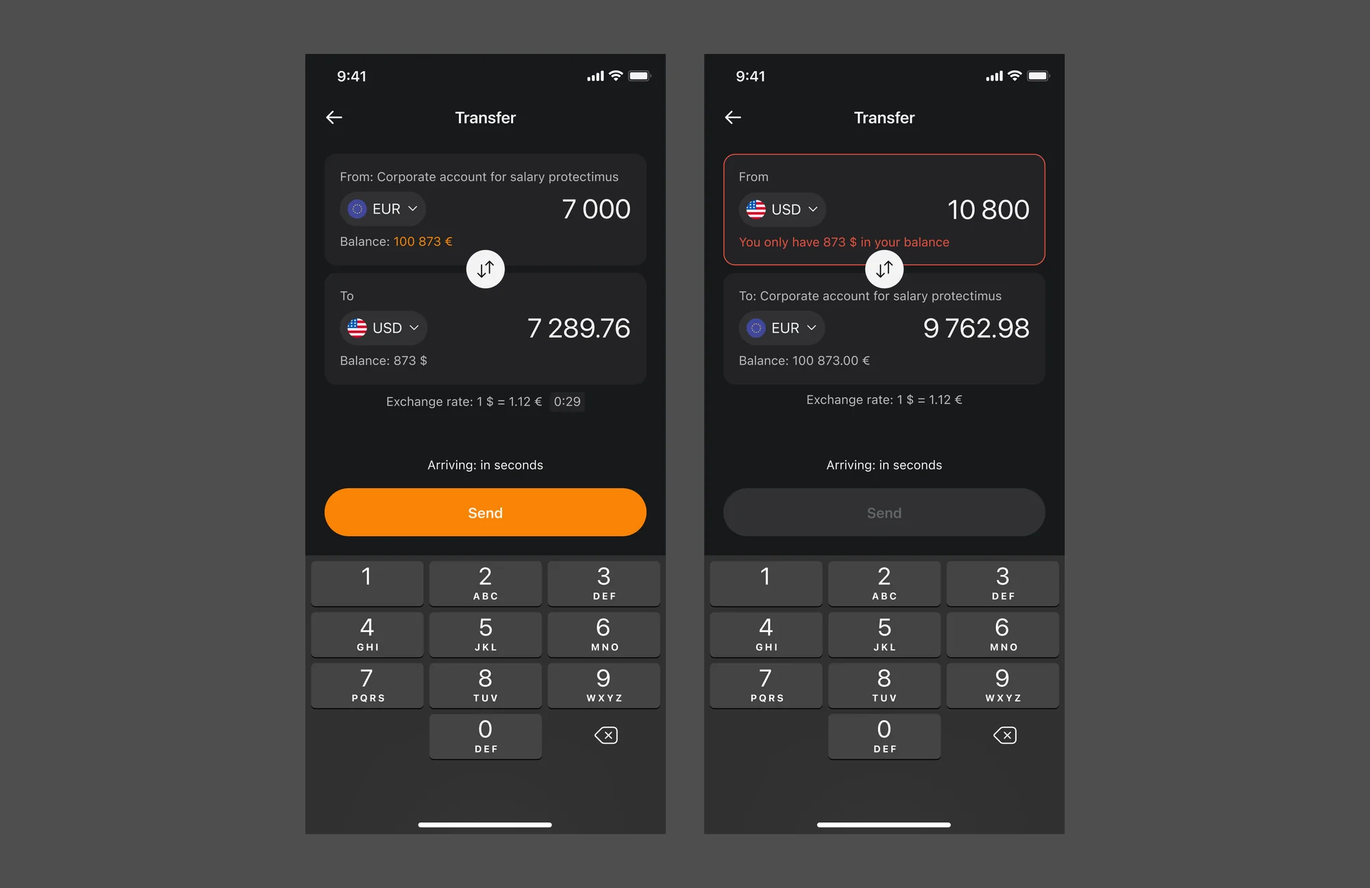
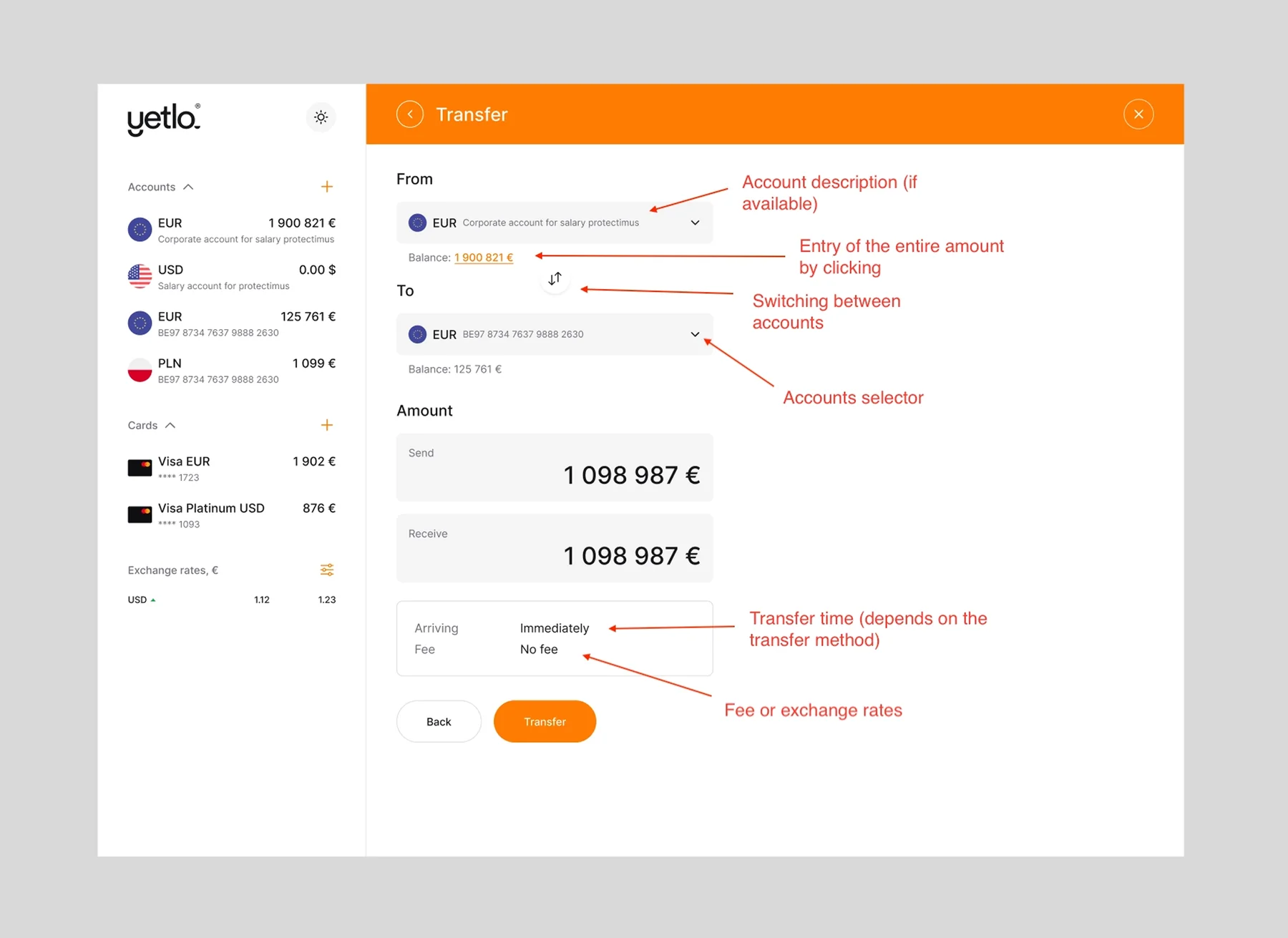
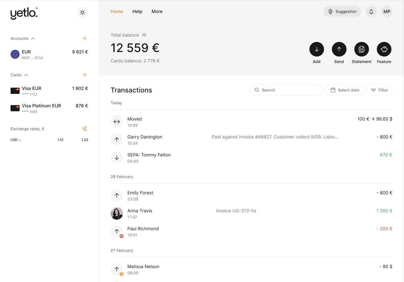
To keep the experience consistent across devices, I brought the same functionality to web — where business users, who rely on web access for complex transactions like SEPA, could transfer funds, view balances, and manage accounts seamlessly.
Impact
Designing within an inherited codebase meant balancing ambition with constraint on every screen. The through-line was building for reuse — every flow I shipped for personal users was structured to extend cleanly to business accounts, which kept the system coherent as scope grew across multiple transfer methods and platforms. Working as the sole designer across web, mobile, and admin also taught me to make decisions that hold up without a team to catch gaps.